Dating BMP by Glaze Colour
Written by Pat Pitcher
What is important to remember in dating from glaze colours is that there are several factors to consider. First is the difference between which colours were offered through the catalogues in any given year, and what might have been made for sale strictly in the factory shop, the studio pottery or as special orders. Seconds, and over-runs of firsts from special orders, may have also been sold at the factory store.
Time frames provided, such as "Harvest Gold 1968 to 1982" also does not mean that every piece made during that time period was necessarily available in the gold. A 1973 catalogue shows all the items available in green, in addition to selected pieces made in Harvest Gold, and others in red.
Since there is not as yet a complete record of catalogues, if a colour is attributed to a certain year, that does not mean it is the only year it was made, but does give a general guideline to the time frame it was available.
Over or under-firing can certainly affect the end result, so a very unusual shade may just be the result of kiln conditions. Factors such as humidity and the number and placement of items in the kiln can also affect the final product. A piece of early 70's red that was over-fired turned out to be a stunning deep black cherry colour with a drip that shaded from blood red to raspberry to almost a pink. A firing mistake, not a "new" colour, but absolutely gorgeous in its own right.
THIS INFORMATION HAS BEEN COMPILED FROM CATALOGUES, ACTUAL HANDS ON EXPERIENCE OF PIECES AND INPUT FROM COLLECTORS. It is by no means a complete record and I'm sure that there probably errors or omissions. I will continue to make additions and corrections as information becomes available to me. If you have any comments or suggestions please feel free to contact me to the record can be expanded and clarified.
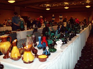
CATALOGUE COLOURS AND COLLECTIONS:
From the beginning, through the early 60's, there is a great variation in the greens and blues seen in the drips. The early under-glazes can range from a light tannish brown to an olivey green, or may be very dark green, or almost black. The drips can be various shades of green, light blue, turquoise and may have hints of cobalt blue, lilac. Many pieces were a rather dark green drip over black.
Green is the most common glaze for BMP and was done consistently by the company from the earliest days right to the end. Early greens often appear almost translucent and often the rich, red clay shows through.
Through the 70's and 80's the green (as well as other glazes) were "thicker" and gave full coverage. The green of this period is usually an emerald toned shade sometimes with streaks of lighter shades, often bluish highlights and sometimes deep forest green appearing to bleed from the black. The finish on both the green and blue of this period are glossy, but no where near as mirror like as the finishes of the 90's to the end of production. The late glazes are high gloss to the point of looking wet.
1960 - Plum - a deep purplish brown or brownish burgundy with hints of white, turquoise or even lilac in the drip.
1950's - possibly into early 60's Aurora Borealis - shades of lilac, purple and blues in the drip over under glazes of purple, dark blue, black or a very deep olivey green.
Likely late 60's - 71 Noah's Ark Collection - bluish grey with golden brown drip, on wood bases. I believe these were made around the same time as the Georgian Bay collection since the rhino figure is common to both.
1967 - 68 Georgian Bay Collection - light olive green (commonly called avocado) drip over brown. Pieces from this collection are also rarely found in a light blue drip over a caramel under glaze - like the candy stripe but missing the greens.
1968 to 1982 Harvest Gold - possibly as late a 1984.
1969 "New Blue" - catalogues begin to show lines available in green or blue.
1973 to 1980 Granite - deep cobalt blue with white flashes (same color is described as "Cobalt" in the 1982-83 or 1983-84 catalogue).
1965 to 1984 Slate - bluish grey with black drip - matte finish Mocha - light brown with dark brown drip - matte finish Celadon green with brown drip - high gloss finish - is on many of the items that were done in slate & mocha - so far no catalogue of this glaze has turned up. Also called seafoam and jade.
1970 - 1973 Red - sometimes appears to have a hint of yellow drip.
1978 - Autumn Red - catalogue pictures seem to show that there is more brown drip than in the earlier red pieces. Red was a very difficult colour to control during every time it was produced. This provides a wide variety of shadings in red glazed pieces.
Time frames provided, such as "Harvest Gold 1968 to 1982" also does not mean that every piece made during that time period was necessarily available in the gold. A 1973 catalogue shows all the items available in green, in addition to selected pieces made in Harvest Gold, and others in red.
Since there is not as yet a complete record of catalogues, if a colour is attributed to a certain year, that does not mean it is the only year it was made, but does give a general guideline to the time frame it was available.
Over or under-firing can certainly affect the end result, so a very unusual shade may just be the result of kiln conditions. Factors such as humidity and the number and placement of items in the kiln can also affect the final product. A piece of early 70's red that was over-fired turned out to be a stunning deep black cherry colour with a drip that shaded from blood red to raspberry to almost a pink. A firing mistake, not a "new" colour, but absolutely gorgeous in its own right.
THIS INFORMATION HAS BEEN COMPILED FROM CATALOGUES, ACTUAL HANDS ON EXPERIENCE OF PIECES AND INPUT FROM COLLECTORS. It is by no means a complete record and I'm sure that there probably errors or omissions. I will continue to make additions and corrections as information becomes available to me. If you have any comments or suggestions please feel free to contact me to the record can be expanded and clarified.
CATALOGUE COLOURS AND COLLECTIONS:
From the beginning, through the early 60's, there is a great variation in the greens and blues seen in the drips. The early under-glazes can range from a light tannish brown to an olivey green, or may be very dark green, or almost black. The drips can be various shades of green, light blue, turquoise and may have hints of cobalt blue, lilac. Many pieces were a rather dark green drip over black.
Green is the most common glaze for BMP and was done consistently by the company from the earliest days right to the end. Early greens often appear almost translucent and often the rich, red clay shows through.
Through the 70's and 80's the green (as well as other glazes) were "thicker" and gave full coverage. The green of this period is usually an emerald toned shade sometimes with streaks of lighter shades, often bluish highlights and sometimes deep forest green appearing to bleed from the black. The finish on both the green and blue of this period are glossy, but no where near as mirror like as the finishes of the 90's to the end of production. The late glazes are high gloss to the point of looking wet.
1960 - Plum - a deep purplish brown or brownish burgundy with hints of white, turquoise or even lilac in the drip.
1950's - possibly into early 60's Aurora Borealis - shades of lilac, purple and blues in the drip over under glazes of purple, dark blue, black or a very deep olivey green.
Likely late 60's - 71 Noah's Ark Collection - bluish grey with golden brown drip, on wood bases. I believe these were made around the same time as the Georgian Bay collection since the rhino figure is common to both.
1967 - 68 Georgian Bay Collection - light olive green (commonly called avocado) drip over brown. Pieces from this collection are also rarely found in a light blue drip over a caramel under glaze - like the candy stripe but missing the greens.
1968 to 1982 Harvest Gold - possibly as late a 1984.
1969 "New Blue" - catalogues begin to show lines available in green or blue.
1973 to 1980 Granite - deep cobalt blue with white flashes (same color is described as "Cobalt" in the 1982-83 or 1983-84 catalogue).
1965 to 1984 Slate - bluish grey with black drip - matte finish Mocha - light brown with dark brown drip - matte finish Celadon green with brown drip - high gloss finish - is on many of the items that were done in slate & mocha - so far no catalogue of this glaze has turned up. Also called seafoam and jade.
1970 - 1973 Red - sometimes appears to have a hint of yellow drip.
1978 - Autumn Red - catalogue pictures seem to show that there is more brown drip than in the earlier red pieces. Red was a very difficult colour to control during every time it was produced. This provides a wide variety of shadings in red glazed pieces.